📖 PRINT |
💻 WEB
Fluid Mutualism
Creative Citizens in Action at California College of the Arts (CCA@CCA) is an annual initiative that “promotes creative activism and democratic engagement through public programs, exhibitions, and curriculum connections”. I was asked to create a visual language and a starting library of graphics for the 2021-22 CCA@CCA theme “Fluid Mutualism”.
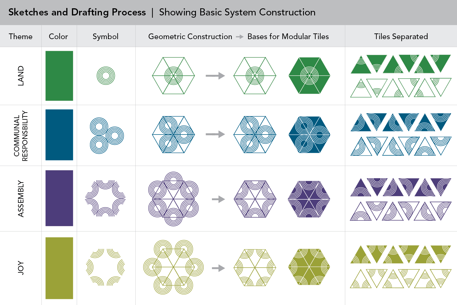
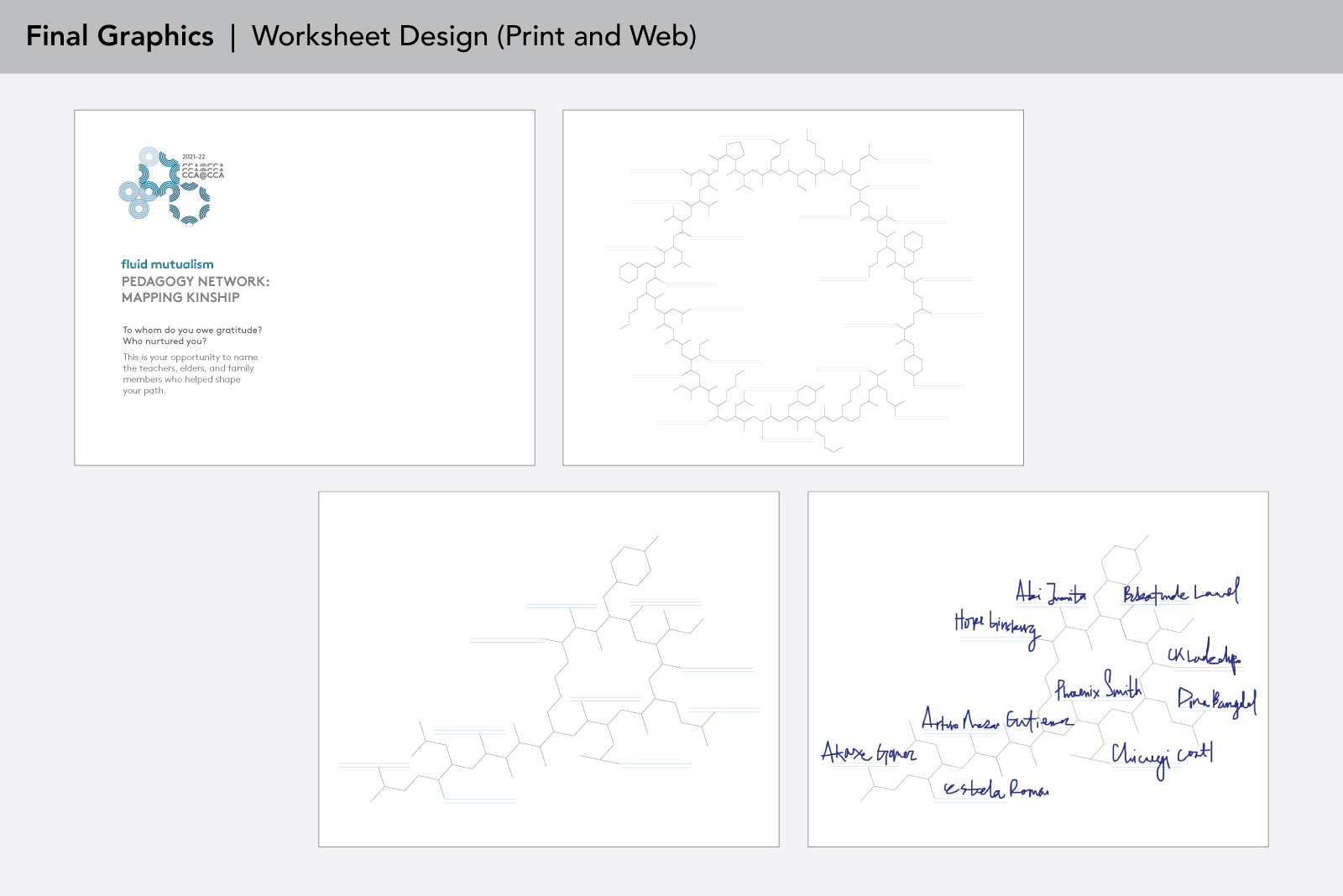
The artist and faculty coordinator who developed the theme for the year, Professor V, was interested in exploring symbiotic relationships in community networks. Inspired by Indigenous practices and philosophies from around the world, Professor V outlined four organizing pillars to inform the year’s programming: Land, Communal Responsibility, Assembly, and Joy. I was tasked with creating a system of graphics that would visually differentiate between these four themes, while also demonstrating that they were interrelated. Images of beehives and honeycomb, logarithmic spirals seen in nature, and chemical structures were provided to me as desired visual cues, in addition to design references including op art and minimal geometric line work.
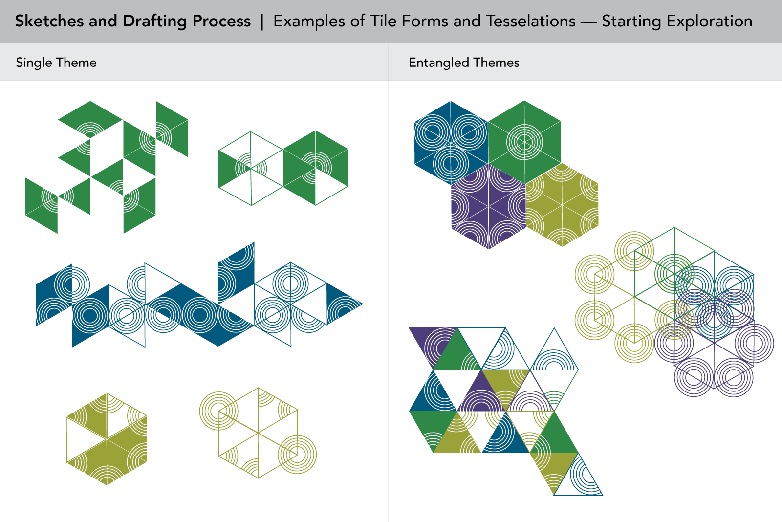
Building off of the visual relationship between honeycomb and chemical structures, the hexagon became a foundational shape for the rest of the graphics. Early sketches and drafts used geometry as a metaphor for how all things are interrelated, where I presented an overall system that was developed using the simple base shapes of a bisected hexagon and concentric circles. Different colors and a set of four geometric configurations represented the four thematic pillars of Land, Communal Responsibility, Assembly, and Joy. By segmenting and reconfiguring the base symbols, a set of tiled building blocks could tessellate into many shapes or dynamic chains to demonstrate inconnection through a visual lineage of evolving forms.
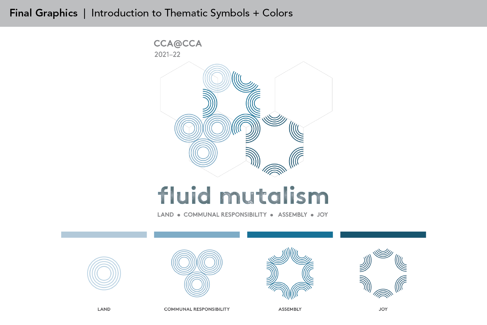
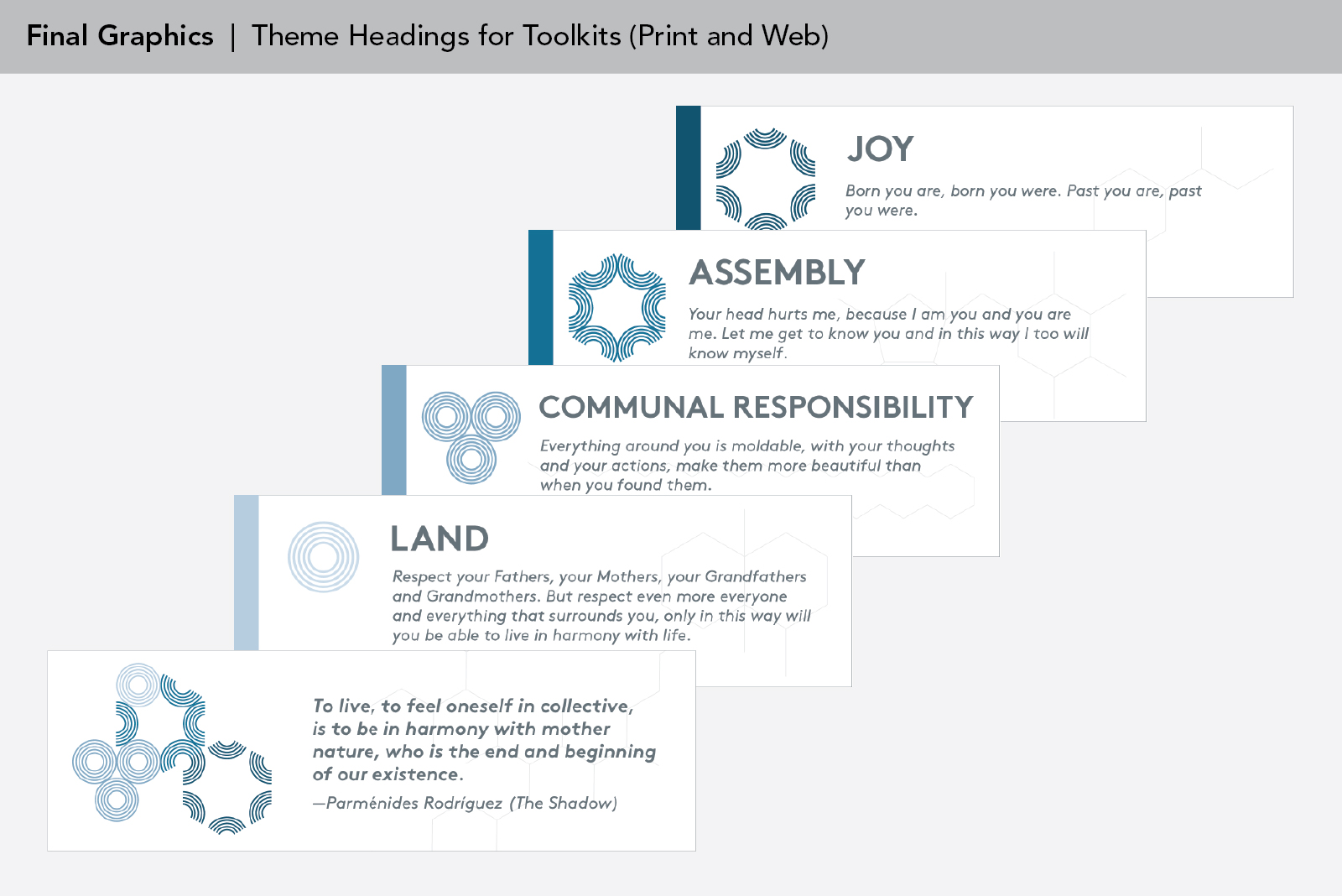
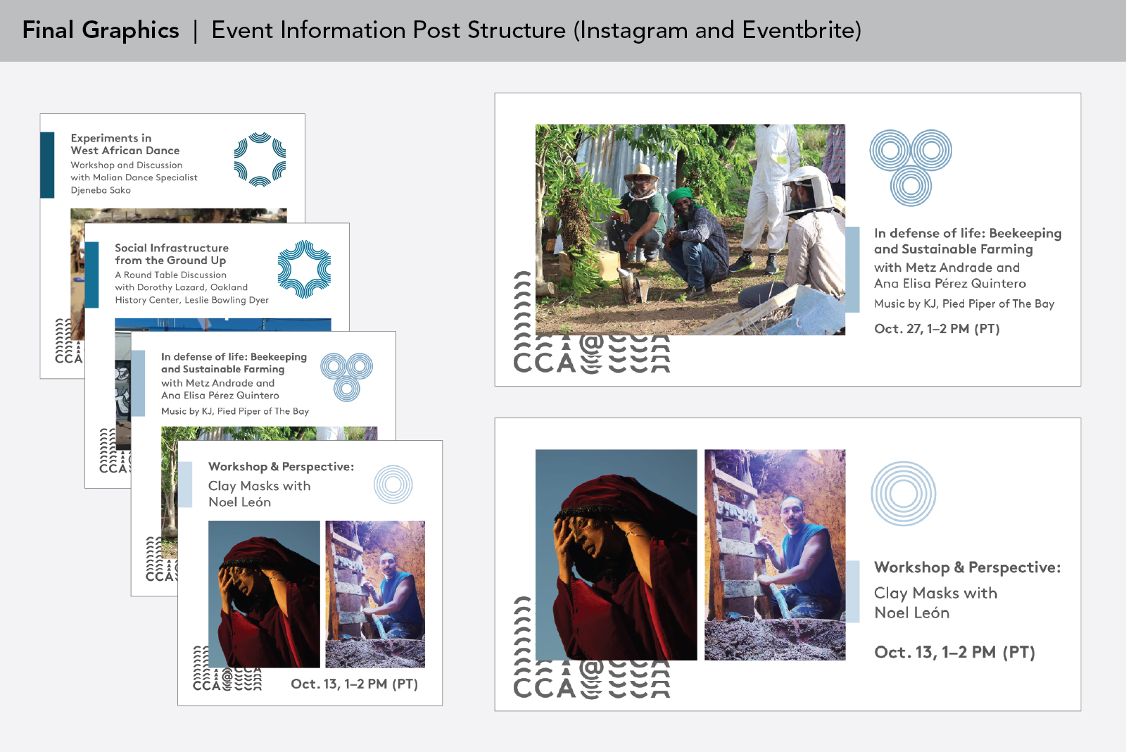
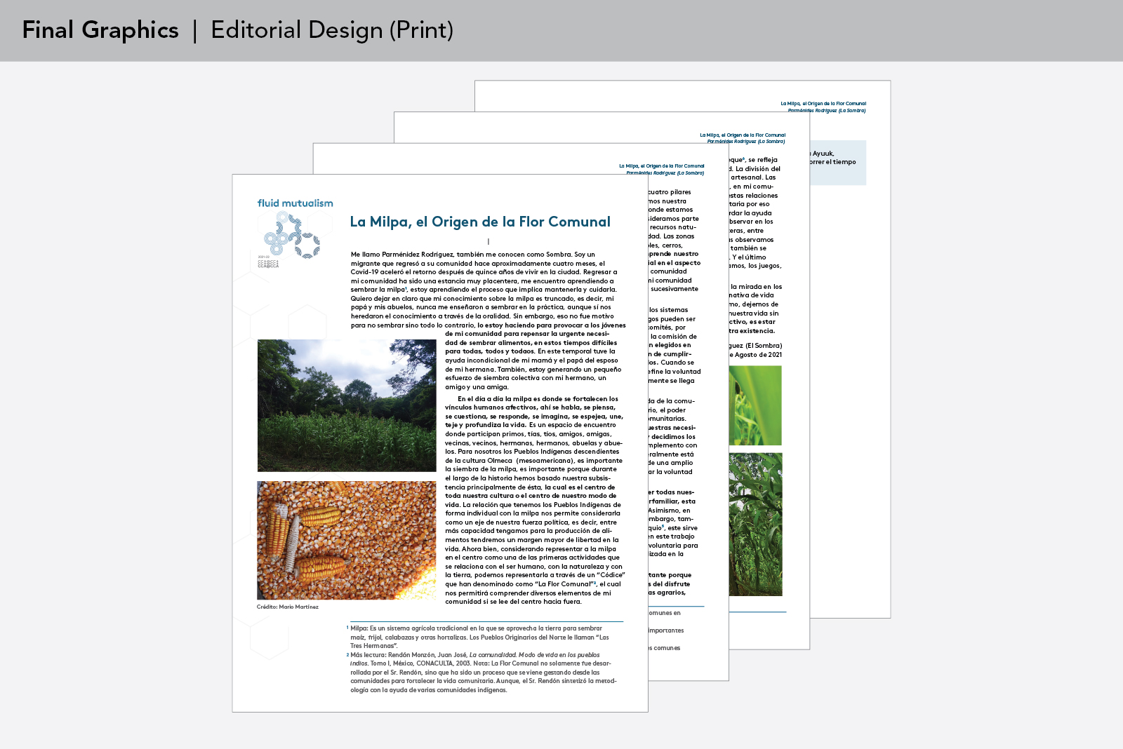
Later iterations and the final design favored instead simplified graphic symbols and a monochromatic color scheme. This was agreed upon as a way to make the visual system easier to hand off to other designers to implement and expand upon over the course of the year. In the final design, each thematic pillar is represented by a shade of blue and a configuration of concentric circles. Additionally, by request, a specific chemical structure is also associated with each thematic pillar: I added this by using the hexagonal chains of chemical structures as background motifs and as structural elements. In addition to developing the foundation for the initiative’s graphics and visual language, I also designed assets for social media, print, and web.